The Paris Report
Not too long ago (as in a little over a month ago), I made a last-minute decision to attend Paris Déco Off and Maison & Objet. It was a decision founded on Goldenbird Design’s commitment to continually source bespoke, sustainable and slightly surprising pieces for our Clients. Pieces that they likely didn’t know existed, and that they suddenly can’t imagine existing without. A curation of which will make their home feel uniquely theirs.
I began drafting this post from Heathrow airport. Glass of champagne in hand, and a host of fresh, highly talented partners in the proverbial rolodex. It will be exciting to see how these partnerships unfold over the course of both ongoing and future projects. For the immediate, I am headed home chalk full of new inspiration, with a friendly reminder from the industry that Goldenbird Design’s inclinations are both of-the-moment and time tested. That is: (1) say yes to choiceful color. And (2) perfectly imperfect is, in fact, perfect. Or, as I like to think of it now: purity is perfection. In other words, if a space is true to the people who reside there, and to its environmental and historical context, then it is its own kind of perfect.
Below I break down my take on the pieces and themes that sparked creativity for me in Paris and will inform Goldenbird Design’s work going forward. I hope that you, too, will find some inspiration in these notes.
Expanding wallpaper applications.
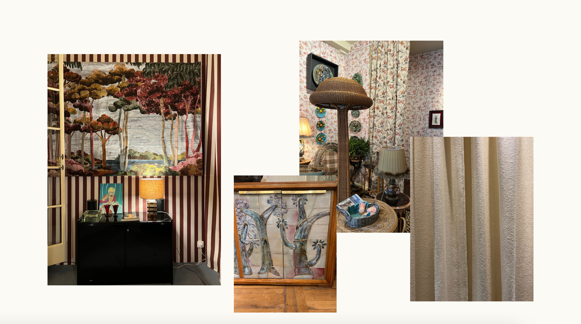
If you know Goldenbird Design, you know we love wallpaper. It’s a relatively low lift way to have a high impact on a space, and we’ve applied it in most rooms of the home, including bathrooms, kitchens and dining room ceilings. I’m inspired by the idea of thinking beyond the four walls (and ceiling) of a room, and beginning to specify wallpaper for paneling, cabinet faces, doors and even some pieces of furniture, like a sideboard.
Building on wallpaper thoughts, I also noticed a theme of pulling a wallpaper pattern or colorway through to drapery panels and upholstery. This isn’t a new trend by any means, but there seems to be an ever-expanding offering of fabrics and papers in corresponding prints and colorways. I was especially excited by Dedar’s new neutral family of fabrics and papers, and Quenin’s Belle Époque collection. Two totally different takes that create equally enveloping spaces.
Of the Earth. From the Earth.
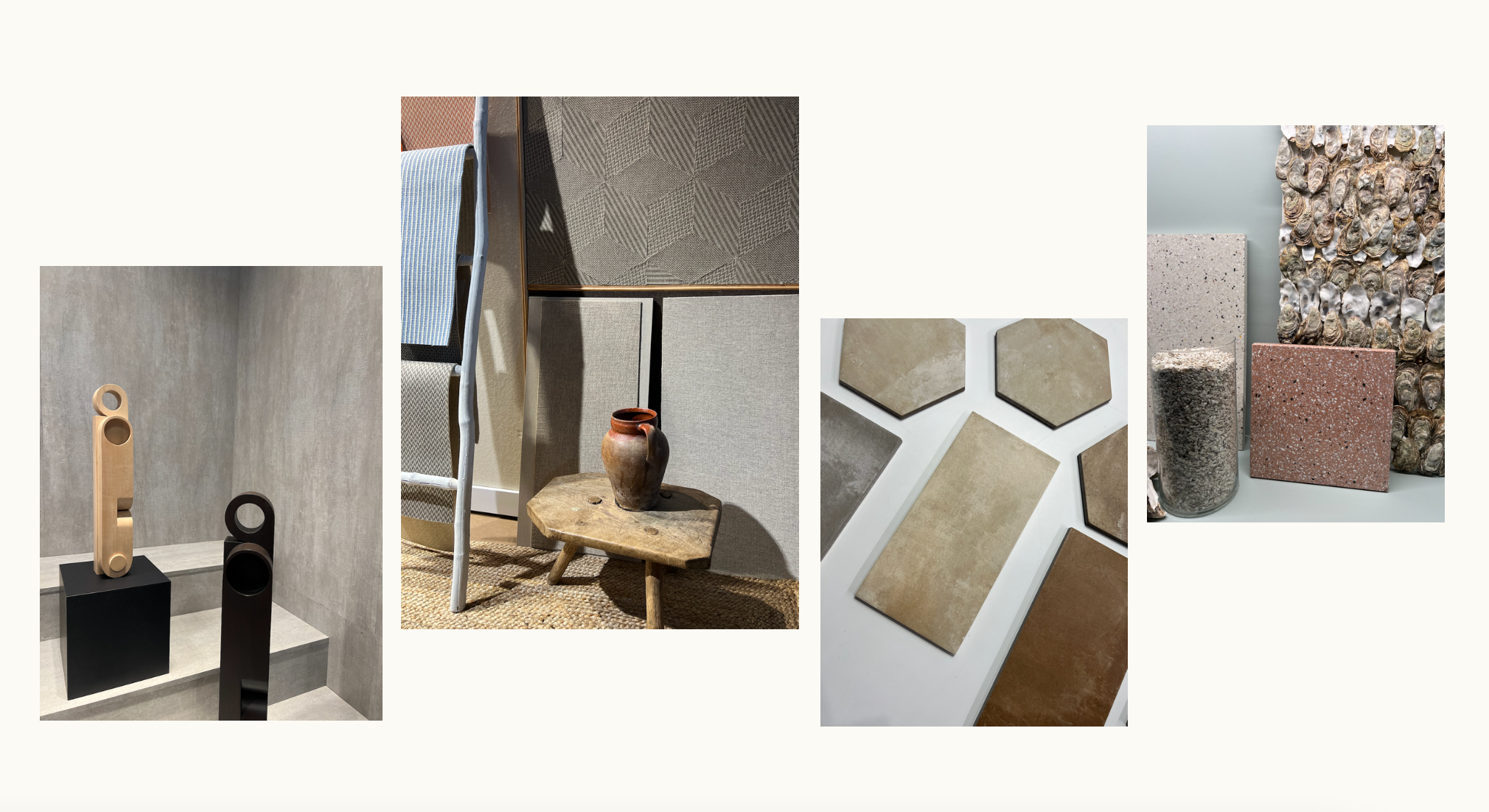
Sustainability is a hot topic in many sectors today, and the interior design industry is no exception. As a girl who grew up in the mountains and maintains an enduring love of our natural world, this is an area I care very much about. Goldenbird Design encourages our Clients to invest in higher quality, harder working pieces that will stand the test of time, and taste. And I am constantly on the hunt for partners with a small footprint in local communities that have an interesting perspective and compelling story to tell. Two that rose to the top for me at Maison & Objet:
Farrás Home produces beautiful, highly textured merino wool wallcoverings made from sheep on their family farm.
Ostrea Design emerged from the discovery that oyster farms in France produce 250,000 tons of shell waste per year, 95% of which is not recycled and ends up in landfills. Their panels liken to reconstituted stone and are made of 65% shells. They share similar properties to marble and look like the most beautiful terrazzo you’ve ever seen.
New neutrals.
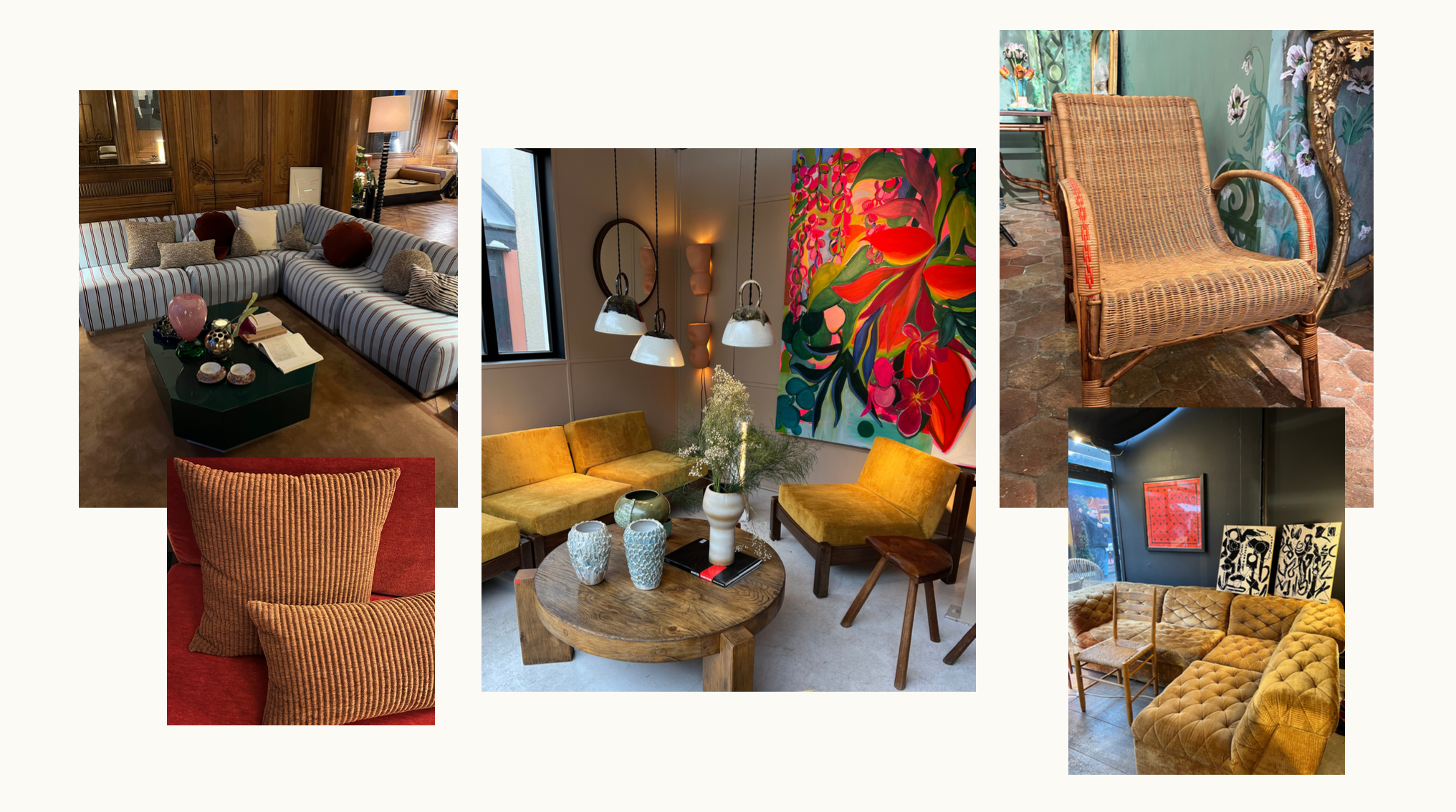
I am absolutely loving the movement towards muted browns and mustards, among which a soft white still has its place. These earthy, rich tones create a space that feels warm and grounded. They are also a wonderful backdrop from which a strong pop of red, aubergine or even navy can exist. Not to play favorites, but I must admit I’m most excited about the incorporation of reds and burgundies.
As these new neutrals take center stage, we are also seeing an evolution of boucle – a tried and true neutral. Don’t worry, boucle isn’t going anywhere. But a chunky chenille fabric as seen in the Nobilis showing, or a micro-boucle that resembles tweed as seen in Dedar’s new collection, offer an alternative, allowing for richer dyes and a broader color palette. I’m personally really looking forward to playing in this color and texture story as I think it does a beautiful job of pulling from and evoking nature.
Mixed materials.
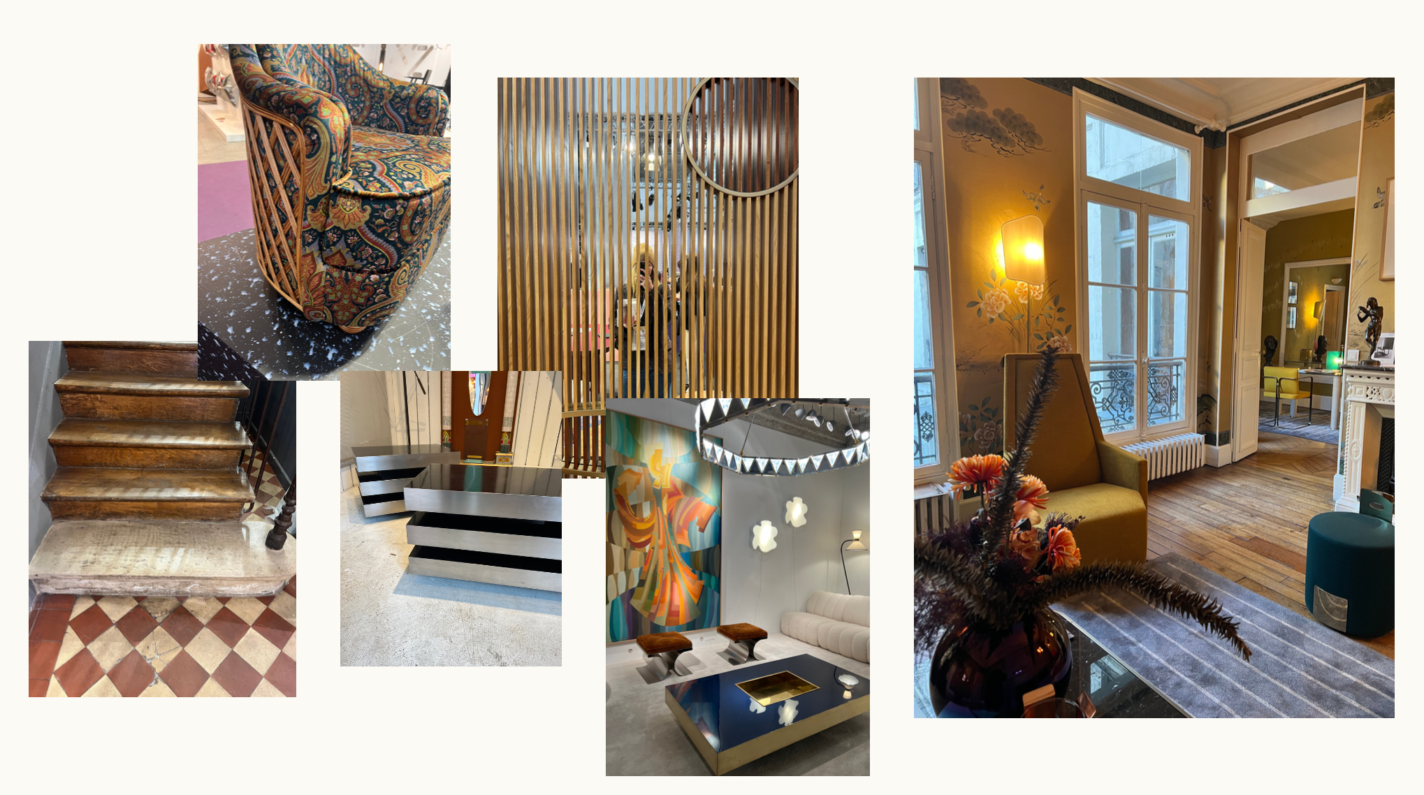
Mixed materials are always a good idea. This is nothing new. That said, the Paris showrooms inspired the use of a few new materials that I’m excited to layer into the mix in new ways. Think: durable cork paired with oak and travertine, and vintage rattan paired with large-scale botanical velvet upholstery. Maison & Objet also introduced unexpected material applications like leather rugs, mirrored glass peeking through slatted wood, suede artwork, and – how wild is this – stationary bikes with a marble wheel.
Metallics are back in a big way. I’m loving the idea of incorporating aluminum in the form of vintage nightstands or gold in a powder bath wallcovering. In the Fromental showroom gold even took residence within the makeup of an area rug.
And finally, lacquer is also having a moment. I’m not yet convinced of the staying power of lacquer, but I do love incorporating small pops in the form of a side table or table lamp. It certainly adds another layer of dimension and intrigue to a space.
The lampshade.
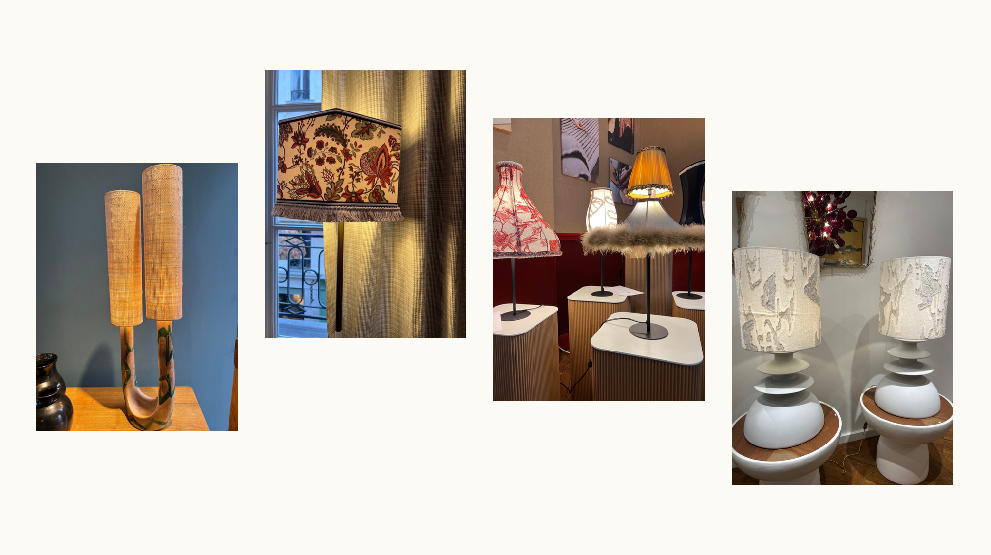
A very focused note compared to the rest, but I just have to share that I was so excited by the wide array of lampshades on display. Ambient lighting is such an important component of a room’s design, and lampshades offer an often-overlooked opportunity to layer pattern, color and texture. Vintage rattan and wicker continued to dominate the scene, while patterned shades with fringe accents took form in surprising shapes that really got me inspired.
xx, mckenzy golding

